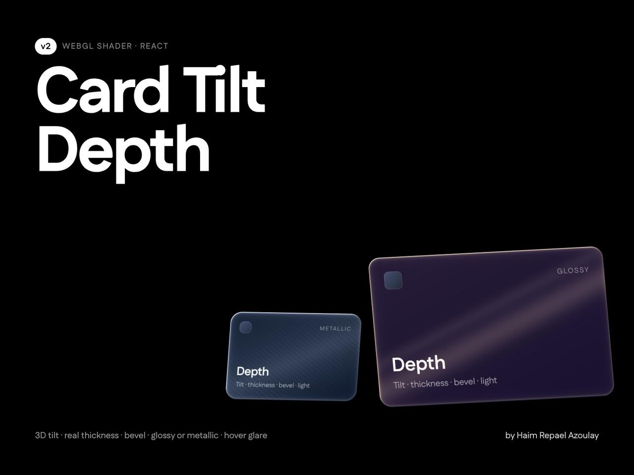
// Copyright (c) 2026 haim repael azoulay. All rights reserved.
import CardTiltDepth from "@/components/ui/card-tilt-depth"

const settings = {
  // body
  thickness: 6, // px, 0 = flat
  bevel: 3, // px bevel on the face rim
  // light & material
  lightAngle: -35, // degrees clockwise from the top
  lightAmount: 0.8, // 0–2
  lightColor: { r: 0.85, g: 0.9, b: 1, a: 1 },
  material: "glossy",
  materialStrength: 0.5, // 0–1
  // tilt
  tilt: 10, // max degrees
  tiltSensitivity: 1, // 0.2–2
  restTiltX: 3.5,
  restTiltY: -4.5,
  perspective: 900,
  hoverScale: 1.02,
  smoothing: 0.18,
  // shadow
  shadowDistance: 24,
  shadowBlur: 36,
  shadowOpacity: 0.55,
  // interactions
  interactions: true,
  hoverGlare: true, // glare runs once when the pointer enters
  glareSpeed: 900, // 200–2000 ms
  glareWidth: 0.16,
  glareIntensity: 0.9,
  glarePasses: "double",
  glareColor: { r: 1, g: 1, b: 1, a: 1 },
  hoverLift: true, // bring the card closer on hover
  liftDistance: 24, // 5–100 px
}

export default function CardTiltDepthDemo(props: Partial<typeof settings>) {
  const s = { ...settings, ...props }
  return (
    <div className="flex min-h-[460px] w-full flex-wrap items-center justify-center gap-12 bg-background p-12">
      {/* 320x200 card (8:5). Pass faceSrc="/my-art.svg" with the same ratio to replace the face. */}
      <CardTiltDepth className="h-[200px] w-[320px]" radius={20} {...(s as any)}>
        <div className="flex h-full w-full flex-col justify-between p-6 text-white">
          <span className="text-xs uppercase tracking-widest text-white/50">Card</span>
          <div>
            <div className="text-2xl font-semibold">Depth</div>
            <div className="text-sm text-white/60">Move your pointer across me</div>
          </div>
        </div>
      </CardTiltDepth>
      {/* round badge: radius >= half the size, metallic material */}
      <CardTiltDepth className="h-48 w-48" radius={999} {...(s as any)} tilt={14} restTiltX={0} restTiltY={0} thickness={4} material="metallic">
        <div className="flex h-full w-full items-center justify-center text-sm text-white/70">metallic</div>
      </CardTiltDepth>
    </div>
  )
}