"use client";

import { Bell, LayoutGrid, Search } from "lucide-react";
import { ThemeToggle } from "@/components/ui/theme-toggle";

const settings = {
  large: false,
  rememberChoice: false,
  showLabels: true,
  startFromSystem: false,
};

/** Bars of the preview chart, in the theme's chart colours. */
const BARS = [
  { height: "h-[38%]", tone: "bg-chart-1" },
  { height: "h-[62%]", tone: "bg-chart-2" },
  { height: "h-[48%]", tone: "bg-chart-3" },
  { height: "h-[80%]", tone: "bg-chart-4" },
  { height: "h-[56%]", tone: "bg-chart-5" },
  { height: "h-[70%]", tone: "bg-chart-1" },
  { height: "h-[90%]", tone: "bg-chart-2" },
] as const;

export default function Demo(props: Partial<typeof settings>) {
  const s = { ...settings, ...props };
  const shared = {
    // Off: the toggles follow the theme the page already has (here, the preview's) until a pick.
    defaultValue: s.startFromSystem ? ("system" as const) : undefined,
    size: s.large ? ("lg" as const) : ("md" as const),
    storageKey: s.rememberChoice ? "theme-toggle-demo" : null,
  };
  return (
    <div className="flex min-h-[560px] w-full items-center justify-center bg-background p-4 text-foreground sm:p-8">
      {/* The start settings apply when the toggles mount: changing one remounts them all, and the
          shared state starts over from storage or `defaultValue`. */}
      <div
        className="w-full max-w-3xl overflow-hidden rounded-2xl border border-border bg-card text-card-foreground shadow-sm"
        key={`${s.startFromSystem}-${s.rememberChoice}`}
      >
        <header className="flex items-center gap-3 border-border border-b px-4 py-3 sm:px-5">
          <span
            aria-hidden="true"
            className="grid size-8 place-items-center rounded-lg bg-primary text-primary-foreground"
          >
            <LayoutGrid className="size-4" />
          </span>
          <span className="font-semibold text-sm">Northwind</span>
          <span className="ml-2 hidden items-center gap-2 rounded-full border border-border px-3 py-1.5 text-muted-foreground text-xs sm:flex">
            <Search aria-hidden="true" className="size-3.5" />
            Search the workspace
          </span>
          <span className="ml-auto flex items-center gap-2">
            <span
              aria-hidden="true"
              className="grid size-9 place-items-center rounded-full text-muted-foreground"
            >
              <Bell className="size-4" />
            </span>
            <ThemeToggle {...shared} variant="icon" />
          </span>
        </header>

        <div className="grid gap-4 p-4 sm:grid-cols-[1.25fr_1fr] sm:p-5">
          <section className="flex flex-col gap-4 rounded-xl border border-border p-4">
            <div className="flex flex-col gap-1">
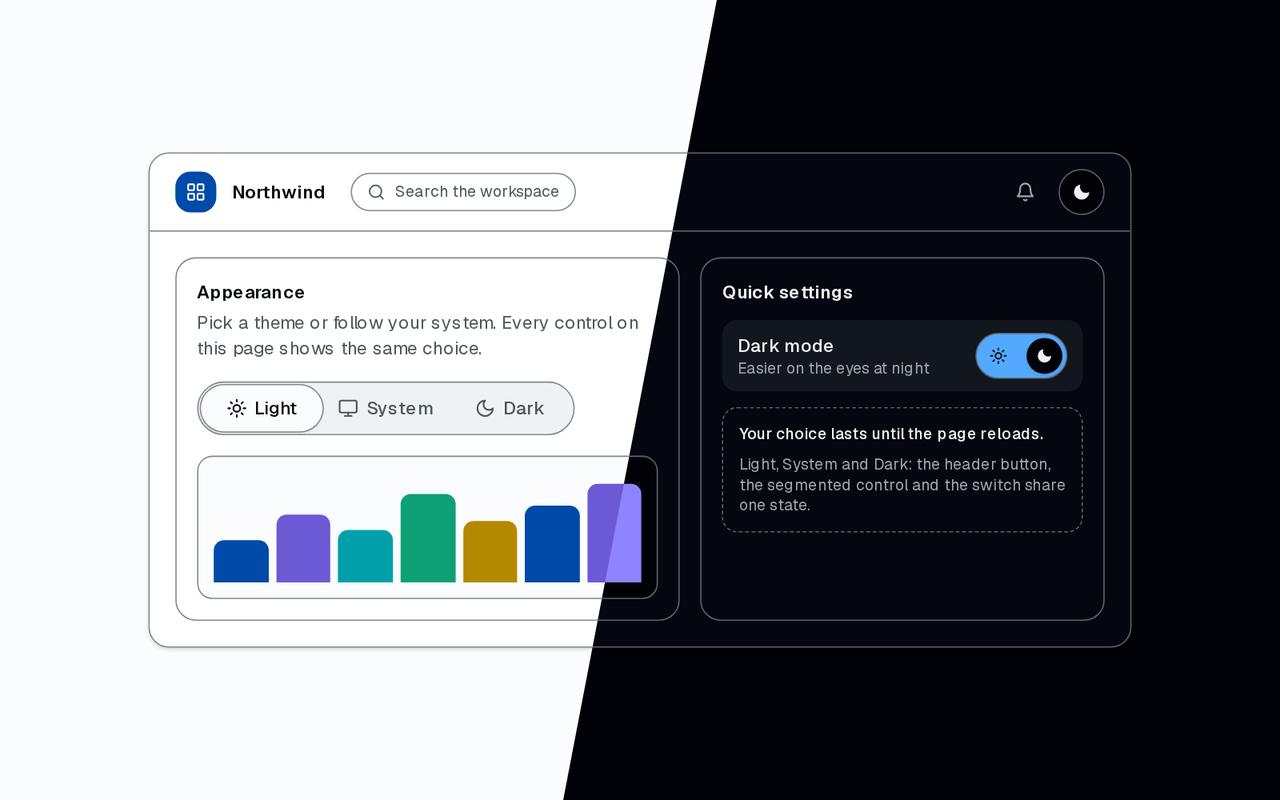
              <h2 className="font-semibold text-sm">Appearance</h2>
              <p className="text-muted-foreground text-sm">
                Pick a theme or follow your system. Every control on this page
                shows the same choice.
              </p>
            </div>
            <ThemeToggle
              {...shared}
              className="self-start"
              showLabels={s.showLabels}
              variant="segmented"
            />
            <div
              aria-hidden="true"
              className="flex h-28 items-end gap-1.5 rounded-lg border border-border bg-background p-3"
            >
              {BARS.map((bar, index) => (
                <span
                  className={`flex-1 rounded-t-sm ${bar.height} ${bar.tone}`}
                  // biome-ignore lint/suspicious/noArrayIndexKey: a fixed decorative list
                  key={index}
                />
              ))}
            </div>
          </section>

          <section className="flex flex-col gap-3 rounded-xl border border-border p-4">
            <h2 className="font-semibold text-sm">Quick settings</h2>
            <div className="flex items-center justify-between gap-3 rounded-lg bg-muted px-3 py-2.5">
              <div className="flex flex-col">
                <span className="font-medium text-sm">Dark mode</span>
                <span className="text-muted-foreground text-xs">
                  Easier on the eyes at night
                </span>
              </div>
              {/* The switch's name matches the visible "Dark mode" beside it. */}
              <ThemeToggle
                {...shared}
                labels={{ dark: "Dark mode" }}
                variant="switch"
              />
            </div>
            <div className="flex flex-col gap-2 rounded-lg border border-border border-dashed p-3 text-muted-foreground text-xs">
              <span className="font-medium text-foreground">
                {s.rememberChoice
                  ? "Your choice is remembered in this browser."
                  : "Your choice lasts until the page reloads."}
              </span>
              <span>
                Light, System and Dark: the header button, the segmented control
                and the switch share one state.
              </span>
            </div>
          </section>
        </div>
      </div>
    </div>
  );
}